How Negative Space Gives a Composition Its Shape
How negative space gives a composition its shape: use a simple looking exercise to see how gaps guide attention and compare images without naming objects.
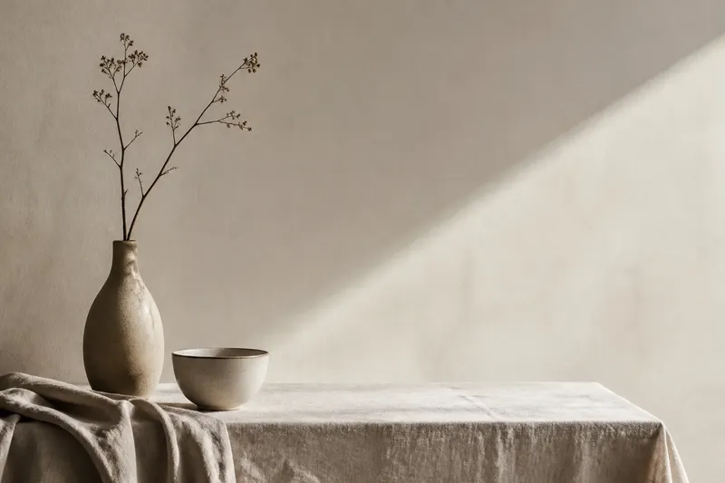
How negative space gives a composition its shape becomes clear when you stop naming the objects for a moment. Look at a photograph, painting, or poster and notice the patch between a person’s shoulder and the edge of the frame. That gap may feel narrow, roomy, tense, or calm before you decide what the person is doing.
Negative space is the area around and between forms. The phrase does not mean empty, unimportant, or literally blank. A pale wall behind a dark chair, a wedge between two figures, and the margin above a title all contribute to the image’s structure. The useful question is not simply what occupies the space, but what shape the space makes and where it sends your eye.
What does negative space change?
Forms are often easier to identify than the intervals around them, so viewers tend to treat gaps as leftover areas. Yet a gap has boundaries of its own. A broad area of sky can make a small building seem isolated; a narrow opening between figures can make them feel connected or crowded. Shift the imagined edge of that opening, and the relationship changes even though neither figure has moved.
Negative space also sets a composition’s rhythm. Repeated gaps can create a steady beat, while one unusually wide interval interrupts it. In a still life, the spaces between a cup, a plate, and a folded cloth can seem evenly paced or awkwardly pinched. The objects supply the notes; the intervals determine how they are spaced.
This is why negative space is more than background. It can balance a heavy area, point toward a focal form, or make a composition feel unsettled. Think of a gap as the margin around words on a page: the letters matter, but the margin helps decide whether the page feels cramped or legible.
Which ways of looking reveal it?
There are three useful approaches, each suited to a different sort of attention. They are not competing theories. Try the one that answers the question you have about the image.
- Trace the outer silhouette. Follow the boundary between the main form and its surroundings. This suits images with a strong central figure, a building, or a clearly outlined object. It helps you see whether the form sits comfortably in its allotted area or presses against the frame.
- Compare interior gaps. Look at the openings between forms: the wedge beneath an arm, the space between two branches, or the strip of tabletop between dishes. This suits crowded scenes and arrangements of several objects. It makes spacing and relationships easier to compare than a list of what is pictured.
- Track open areas across the frame. Follow broad regions of sky, wall, water, or unmarked paper from one side to another. This suits spare compositions or images where the focal point is not obvious. It shows how open areas carry the eye and whether they counterbalance a dense cluster.
Choose by the image’s problem, not by a rule. If one figure dominates, trace its silhouette. If the scene feels congested, compare the interior gaps. If the image seems strangely lopsided despite having few forms, follow the open areas. These methods can overlap, but starting with one keeps the viewing deliberate rather than turning into a hunt for every possible detail.
How can you try the negative space exercise?
Use any image already to hand: a gallery reproduction, a book illustration, or a photograph on your screen. No drawing skill or special equipment is needed. The point is to notice shape before interpretation takes over.
- Choose one clear region, such as the space between a form and the frame, or the gap between two forms.
- Describe its outline using plain visual terms: triangular, tapering, hooked, broad at one end, or nearly parallel.
- Compare it with a nearby gap. Ask which is wider, longer, more enclosed, or more irregular.
- Notice where your eye goes next. Does the gap lead toward a face, an edge, another object, or nowhere in particular?
- Return to the whole image and decide how that interval affects its balance or mood.
Say you are looking at an invented poster with a person placed near the left edge and a large pale opening to the right. You describe the opening as broad near the top and narrowing toward the person’s hand, then compare it with the small gap above the person’s head. The expected observable result is a clearer sense of how the open area draws attention back toward the figure, without needing to decide what the poster means.
Keep the description concrete. “The gap narrows toward the hand” gives you something visible to check; “the empty area feels meaningful” may be true, but it is not yet an observation. Interpretation can follow after you have noticed the arrangement.
Why can the same gap feel different?
Negative space depends on its neighbors. A narrow interval between two upright forms may feel like a channel; the same width between a diagonal form and a frame edge may read as a wedge. Direction matters, as do contrast, color, and the shape of the boundaries. There is no universal measurement at which a gap becomes cramped or spacious.
Edges also vary in strength. A crisp dark outline makes a gap easy to follow, while a soft transition can blur where one form ends and another begins. In a painting, color may connect distant open areas even when their outlines differ. In a photograph, a bright window can pull attention through an otherwise shadowed interval. Look for the visual evidence before assigning a fixed role to the space.
Negative space is not a secret code, either. A large empty region does not automatically signify loneliness, and a tight gap does not prove conflict. Those readings may be plausible when supported by the rest of the image, but the space alone establishes a compositional effect, not a single intended message.
What questions help you read negative space?
Does negative space have to be white?
No. It can be any area around or between forms, whether it is painted, shaded, patterned, or left as bare paper. “Negative” describes its relationship to the forms, not its color or value.
How is negative space different from background?
Background usually names an area behind a subject, while negative space draws attention to the shapes around and between forms. The same wall can function as both background and negative space when its shape affects the subject’s placement.
Can a composition have more than one focal point?
Yes. Several forms can attract attention, and the intervals between them can guide the eye from one to another. Compare the gaps to see whether they connect those points, separate them, or leave one area unusually dominant.
Should I start with the objects or the gaps?
Start with whichever is harder to understand. If the subject is obvious but the composition feels awkward, examine the gaps; if the image is unfamiliar, identify a few major forms first and then trace the spaces they create.
How do you choose a looking approach?
Let your first response decide. A figure that seems pressed against an edge calls for a silhouette check; a crowded arrangement calls for comparing interior gaps; a sparse image with uncertain balance calls for tracking open areas. If one approach reveals a shape you had overlooked, stay with it long enough to compare that shape with its neighbors.
That is the practical value of negative space: it gives you a way to describe composition without reducing an image to its subjects. The next time a picture feels balanced, cramped, or oddly quiet, ask what the gaps are doing. Often the answer is sitting plainly between the forms.